

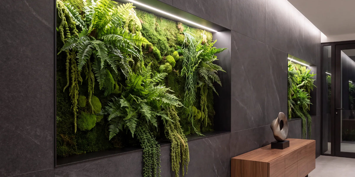
Choosing low maintenance artificial plants for office interiors is not simply a matter of filling an empty corner. The right botanical presence can soften a formal room, lend a reception area a sense of welcome, or bring quiet balance to a workspace that feels polished but unfinished. The selection begins with the room itself: its architecture, circulation, light, furniture scale and atmosphere.
Book a private design consultation
Begin with the feeling the room needs
Before considering a species, planter or height, name what is missing. A workplace may feel cold because hard surfaces dominate. A reception area may seem sparse despite an impressive desk. A conference room may feel visually busy, with no calm element to settle the composition. These are different design conditions, and they call for different botanical forms.
Take a short walk through the office at the time of day it is most often used. Notice what a visitor sees on arrival, where the eye rests while seated, and which transitions feel abrupt. Look at the room from more than one position. A plant that appears balanced beside a desk when viewed straight on may obstruct a passage or overwhelm the room from the entrance.
- For a room that feels severe: consider a rounded, branching or softly layered form that brings a more organic silhouette to the architecture.
- For an entrance that feels empty: identify a location where a single statement composition can be seen without narrowing the path.
- For a large room that lacks focus: look for a form with enough height and visual presence to relate to the ceiling and major furnishings.
- For a small office that feels crowded: use a restrained profile and keep the composition clear of work surfaces and circulation.
- For a room that feels impersonal: choose a botanical character and vessel that reflect the materials, color and point of view already present.
This first step helps distinguish a design need from a shopping impulse. The aim is not to add greenery everywhere. It is to create a deliberate relationship between the botanical composition and the room.
Read the architecture before choosing a plant
Look at the office as a complete setting. Note the ceiling height, window placement, wall treatment, flooring, furniture profiles and dominant finishes. Botanical art should belong to those elements rather than appear as an afterthought. A sculptural tree beside a tall window has a different role from a low arrangement on a reception console. Both may be appropriate, but they answer different needs.
Start with the room’s strongest architectural lines. If the interior is defined by vertical paneling, tall doors or high windows, a vertical botanical silhouette may reinforce that sense of height. If the room has a long horizontal desk or low seating, a broad canopy or carefully placed tabletop composition can introduce a complementary line. Where the architecture is ornate, a simple form may offer a welcome pause. In a spare, modern office, the vessel and branching structure can provide much of the visual character.
Color matters, but it does not need to match exactly. Consider the temperature and intensity of the surrounding palette. Deep wood, stone, metal and upholstery may call for a composition with a measured presence; pale walls and restrained furnishings may support a more expressive silhouette. The goal is an intentional relation, not a perfect color match.
Also consider how the office changes through the day. Sunlight may shift across a lobby, while a private office may rely on steady overhead lighting. Reflections from glass, screens or polished stone can change how a composition reads. Observe the setting under its usual conditions, not only under the bright light of a single viewing.
Choose scale with a few practical checks
Scale is one of the most important decisions because a piece can be well crafted and still feel wrong if it is too small or too large for its setting. Think about the full composition, including the vessel. Do not judge height by foliage alone. The planter’s width and visual weight affect the balance just as much as the branching form above it.
Measure the full footprint
Measure the available floor area or surface before browsing. For a floor piece, mark the intended footprint with painter’s tape or paper. Leave room for doors, drawers, chair movement, cleaning and the natural path from one area to another. A large composition should feel generous, not obstructive. If the piece will sit beside a desk, check that it does not interfere with storage or the person seated there.
For a console or table, measure both the surface and the vertical space above it. Account for lamps, artwork, signage and objects that already occupy the area. A tabletop arrangement can become visually dominant when it competes with a monitor or a lamp, even if its actual dimensions seem modest.
Compare it with nearby furnishings
Use the desk, credenza, sofa or reception counter as a reference. A tall element may relate well to a high-backed chair or a substantial wall feature; next to a delicate side table, it could feel out of proportion. Consider the width of the canopy as well as its height. In a narrow corridor, a spreading silhouette can interrupt movement even when its base is small.
When a space is open plan, consider sightlines between zones. A composition may help mark the edge of a lounge or waiting area, but it should not become a visual barrier between colleagues. If a piece is intended to define a threshold, view it from both sides and consider whether it supports the transition without making the room feel divided.
Evaluate the negative space
Negative space is the area left open around an object. It is not wasted space. A botanical composition usually feels more considered when it has breathing room, especially in a refined office with clean lines. Avoid squeezing a piece between a cabinet and a wall, or placing it where several unrelated objects gather around it. If the location feels crowded before the piece arrives, edit the surrounding objects first.
A useful test is to stand at the entrance and look for one clear focal point. If the eye moves immediately between a plant, a sign, a lamp, a display and a busy wall, the arrangement may need editing. A single well-proportioned element can have more presence than several small pieces competing for attention.
Test the outline before deciding
A temporary outline helps make dimensions tangible. Use a tall cardboard template or a taped vertical marker to represent approximate height, then mark the base width on the floor. This does not reproduce branching detail, but it reveals whether the proposed scale would sit comfortably beside a counter, window or doorway. For a tabletop selection, use folded paper or a simple container of similar dimensions to judge how much of the surface remains usable.
Review the mock-up from the doorway, the nearest seat and the usual walking path. Ask someone who uses the room to view it from their normal position. If the location only works from one carefully chosen angle, reconsider the footprint or silhouette. A modest test can prevent a purchase that looks persuasive in a product image but feels intrusive in daily use.
Match the form to the office zone
Different areas of a workplace have different responsibilities. A reception space welcomes visitors and often sets expectations for the entire organization. A conference room needs to support attention and conversation. A private office can express more of an individual point of view. Rather than repeating the same composition in every room, select each piece for its role.
Reception and waiting areas
In a reception area, consider what is visible from the entrance and where visitors pause. A tree or substantial floor composition can give a large lobby a point of focus, especially when the architecture leaves a generous area beside seating or a reception desk. Keep the circulation route clear, and check that the composition does not obscure a sign, directory or view into the room.
For a smaller waiting area, a carefully scaled arrangement on a console may be sufficient. The composition should be legible from a seated position and should not take over the surface. If there are magazines, lighting or visitor materials nearby, leave those elements accessible and visually calm.
Executive and private offices
A private office often combines work, conversation and reflection. Choose a location that is visible without competing with the desk. A floor composition can soften an unused corner; a small floral or plant arrangement may bring a quiet accent to a credenza or meeting table. Consider what the person sees while seated, not only what a visitor sees when entering.
Be thoughtful around video calls. A composition in the background can add depth, but a busy or oversized form may distract from the person on screen. Check the camera framing from the usual seating position. A piece that appears balanced in the room can look crowded or oddly cropped in a camera view.
Conference and meeting rooms
Conference rooms are already organized around a table, chairs and a shared focal point. Any botanical element should support the room without getting in the way of conversation, presentation screens or sightlines. A low, restrained arrangement may suit a central table only when it leaves clear space for materials and does not interrupt views across the table. In many rooms, a floor composition near a wall or at a corner is easier to live with.
Check the room from every seat. A placement that looks attractive from the doorway may block a screen or distract someone seated at the end of the table. In smaller meeting rooms, consider whether the existing furnishings already provide enough visual detail.
Breakout spaces and corridors
Informal lounges and breakout areas can accommodate a softer, more relaxed character. A composition near seating may help establish a sense of retreat, provided it does not narrow the route or crowd a side table. In corridors, prioritize width and clearance. A slim profile in a generous recess may be appropriate; a broad form in a tight passage can make daily movement feel constrained.
When selecting for shared spaces, consider the whole route rather than the single spot. A sequence of rooms can feel coherent through repeated materials or a consistent palette without repeating identical pieces. Let the architecture guide where a composition belongs and how much visual emphasis each zone needs.
Coordinate a suite of connected spaces
In an office suite, assess the entrance, reception point, meeting room and informal area together. A visitor experiences the sequence, not a series of isolated photographs. Choose one principal focal point, then let smaller supporting compositions carry a related shape, vessel finish or color note into adjoining rooms. This creates continuity without making every zone feel duplicated.
For example, a substantial branching composition may establish the character of a reception area, while a restrained tabletop arrangement can echo its warm vessel tone in a nearby meeting room. The relationship can be subtle. Repeating every species, height and planter can make the suite feel overly arranged; using one or two shared cues is often enough to make the movement between spaces feel intentional.
Consider species, silhouette and atmosphere
The species or botanical character shapes the mood as much as color does. A branching tree can suggest height and structure. A leafy form may bring softness and a fuller outline. Grasses can feel lighter and more linear. Florals can introduce a focal note, while succulents and compact plants often suit a smaller surface or a restrained accent. These are visual roles, not rules; the room and the selected piece determine the final effect.
Study the outline from a distance. Does it feel airy or dense? Does it have a clear trunk or stem structure? Does its shape relate to the scale of the room? The foliage should be considered as a mass and as individual detail. In an executive interior, a form that feels composed from across the room may be more effective than one whose appeal depends on close inspection alone.
Think about the atmosphere the room should convey. A symmetrical, disciplined arrangement may suit a formal reception space. A more irregular branching form may bring movement to a quiet corner. A restrained floral composition can add softness without changing the room’s overall character. Select a mood intentionally, and avoid trying to make one piece solve every design challenge at once.
Let the composition meet the room at the right distance
People experience a workplace at different distances. Visitors may first see the composition across a lobby, then pass beside it. Employees may encounter it repeatedly from a desk or corridor. Consider whether the piece has a pleasing overall silhouette at a distance and a considered finish when someone is nearby. A composition intended for a high-traffic entrance should read clearly without demanding close attention; a piece on a private-office credenza may be viewed at shorter range.
Distance also affects visual density. Fine branching may appear graceful close up but disappear against a complex background from across the room. A dense canopy can feel rich at a distance yet dominate a compact corner. Look at the candidate location from the actual viewpoints people use, then choose a botanical character whose outline remains balanced in those views.
Give the vessel the same attention as the foliage
The vessel is part of the composition, not a finishing detail to decide later. Its shape, finish, proportion and visual weight help anchor the botanical form. A broad vessel can ground a spreading silhouette; a narrower profile may keep a vertical composition visually light. The right vessel relates to the architecture and neighboring materials as well as to the plant itself.
Compare the vessel with nearby finishes. Stone, wood, metal and ceramic each create a different impression. A vessel might echo a material already in the room, or introduce a restrained contrast. Consider whether a glossy finish will compete with reflective surfaces, or whether a textured finish will bring a welcome note to a smooth interior.
Proportion is important. A vessel that appears too small can make a tall composition feel unstable, while an overly substantial base may dominate a delicate arrangement. Step back and judge the silhouette as one complete object. If you are considering a configured catalog piece, review the vessel options and selected dimensions together rather than choosing foliage and container separately in your imagination.
In an office, practical details matter too. Consider the vessel’s footprint, its position relative to furniture and how it will be moved if the room is rearranged. Keep a clear path for routine cleaning and avoid placing it where people may brush against it repeatedly. These decisions help the piece feel integrated into the room rather than simply placed within it.
Check the base against its setting
Look at the lower portion of the composition as carefully as the canopy. A vessel placed on patterned flooring may need a clear outline to remain legible. On a plain floor, a quieter profile can preserve the calm of the room. When the piece sits beside a credenza or reception desk, compare the vessel’s visual weight with the furniture base and nearby hardware. The aim is not to repeat every finish, but to make the transition from floor to object feel deliberate.
For a tabletop arrangement, include the surface color in this assessment. A low vessel can visually disappear on a dark table, while a highly contrasting base may draw attention away from the composition. View the vessel alongside a sample or photograph of the actual finish whenever possible. Small choices at the base can determine whether the full piece feels settled or slightly disconnected.
Use light as a design consideration
Light changes the way color, texture and silhouette are perceived. Before choosing a location, notice whether daylight is direct, filtered or limited, and whether artificial lighting casts a warm or cool tone. A composition beside a window may be prominent throughout the day; one in a dim corner may need a lighter palette or a nearby lighting source to remain visually distinct.
Do not assume that a botanical piece is suitable for outdoor exposure or for every lighting condition. Outdoor suitability is specific to the individual product. If a location receives prolonged sun or sits outdoors, confirm the particular item’s stated guidance before selecting it. A general impression of durability is not a substitute for product-specific information.
Also look for glare and shadow. Glossy walls, glass partitions and polished floors can create reflections that change the effect of a vessel or foliage. Overhead lights may cast shadows on nearby walls. View the intended location at several times of day when possible, and make the final decision in the conditions under which the office is normally used.
Observe the room on an ordinary workday
Assess lighting in context rather than relying on a single empty-room visit. Turn on the lamps and overhead fixtures normally used, close blinds to their customary position, and note where the strongest reflections fall. If a room is used for presentations, check how its lighting changes when a screen is active. A composition that reads well in daylight may become a dark shape against an unlit wall after hours.
Use a few simple notes: the brightest period, whether direct sun reaches the location, and whether nearby glass or polished surfaces create glare. These observations help narrow the placement and give a designer or product adviser practical context. They also discourage assumptions based only on a product image photographed in different lighting.
Plan placement around people and movement
A workplace is used continuously. A composition must work with doors, chairs, carts, cleaning routines and the everyday flow of staff and visitors. Trace the paths people use most. Check door swings, accessible routes, desk access and the space needed to move a chair. A piece should not require people to change their normal route around it.
Think about how the composition relates to safety and visibility without making assumptions about product certifications. Keep it away from places where it could be struck, block an exit or obscure important signage. If workplace requirements apply, confirm the location and product suitability with the appropriate facilities or design professional before ordering.
For a shared office, consider the perspective of different users. A high composition may be striking from the entrance but feel imposing from a nearby workstation. A low arrangement may be elegant on a credenza but disappear behind a reception counter. Review the view standing, seated and moving through the room.
Finally, consider whether the location will still make sense if furniture moves. A piece that depends on a precise gap beside one desk may be difficult to reposition later. More adaptable locations, such as a defined corner or a dedicated console, can preserve the composition when the room changes.
Confirm everyday access before placing an order
Ask the people responsible for the office how the room is cleaned and rearranged. A floor composition should not make it difficult to reach a window, outlet or frequently used cabinet. In a reception area, staff may need room to open drawers, move a chair or retrieve visitor materials. In a meeting room, confirm that the piece does not narrow the route around pulled-out chairs.
Also consider who will move the composition if the room layout changes. A piece that is intended to be repositioned should have a practical route out of its location, including through doors and around corners. If dimensions or handling requirements are unclear, request product-specific guidance. Thoughtful planning lets the botanical presence remain part of the room rather than a recurring obstacle to its use.
Choose between a configured piece and a room-specific proposal
There are two useful ways to approach selection. A configured piece from the Jardin Du Monde catalog may suit a room with a clear location, a known size and a defined visual need. A design consultation may be helpful when several choices remain open or when the botanical composition must relate to a wider set of architectural and furnishing decisions.
When choosing a catalog piece, gather the measurements first. Review the full dimensions, vessel options and product-specific notes. Compare those details with the available footprint and the view from the room’s main entrance. If a product page does not answer a question that affects placement or suitability, seek clarification before placing an order.
A consultation can provide a more room-responsive path. The design discussion may take place virtually or in person and considers the room and its décor before a botanical proposal is prepared. The proposal may address placement, vessels, materials and scale. Delivery or on-site styling can be requested, but should not be assumed to be included in every purchase. Ask what is relevant to the specific project rather than assuming a standard scope, fee or schedule. For inspiration as you prepare, explore the Jardin Du Monde journal.
To make a consultation useful, prepare a concise brief. Include room photographs taken from several angles, approximate ceiling height, measurements for the intended location, a note about the room’s usual light, and images of key finishes or furnishings. Explain how the space is used and what feels unresolved. You do not need a complete design vocabulary; a clear description of the feeling you want to change is a strong starting point.
Keep the brief focused. Mention whether the piece is for a reception area, private office, conference room or another setting. Identify any objects that must remain in place, such as signage or a screen. If you have a preferred botanical character, describe it, but remain open to a form that better answers the room’s scale and atmosphere.
Prepare a concise room brief
A short, organized brief is more useful than a large folder of unrelated inspiration. Begin with the room’s purpose and the impression it should create. Add a measured sketch or a few dimensions, then label the photographs so the intended location is clear. If there are existing furnishings that cannot move, note them. Include the materials that most strongly influence the palette, such as wood, stone, metal or upholstery.
Separate preferences from requirements. A preferred species or color can guide the discussion, while a clear walkway, unobstructed screen or available floor footprint is a practical constraint. This distinction gives the proposal room to respond to the architecture while keeping essential needs in view. It also makes it easier to identify which questions remain open before a selection is finalized.
A measured selection process
A simple sequence can keep the decision grounded and prevent avoidable uncertainty.
- Define the room’s need. Write one sentence about what feels missing or unsettled: height, softness, a focal point, a more welcoming entrance or a quieter transition.
- Select a candidate location. Choose a spot based on sightlines and use, then check the route around it. Do not begin with a product and search for somewhere to put it afterward.
- Record dimensions. Measure height, width and depth. Include door swings, furniture and the clear space people need to move.
- Set the visual role. Decide whether the composition should be a statement, a supporting accent or a subtle element. This determines how much scale and contrast the setting can support.
- Consider form and vessel together. Evaluate the full silhouette and base against the architecture, finishes and nearby furniture.
- Review product details. Check dimensions, configuration choices and relevant care or placement guidance for the specific item. Confirm any unresolved issue before purchase.
- Choose the right path. Select a configured piece when the choice is clear. Request a design discussion when the room needs a tailored proposal or several elements need to be considered together.
- Revisit the composition in context. Before finalizing, look again at the entrance view, seated view, circulation and available negative space.
This process is deliberately modest. It turns a broad desire for greenery into a few concrete questions about the actual workplace. A precise decision usually begins with the room’s needs, not with a long list of products.
Keep a one-page decision record
Before settling on a composition, record the location, maximum footprint, desired visual role, nearby materials and any product question that still needs an answer. This small record helps a team discuss the same proposal rather than relying on different mental pictures. It is especially useful when the person selecting the piece is not the only person who uses or maintains the office.
For instance, note that a reception composition should be visible from the main entrance, remain clear of the visitor route and relate to the warm wood at the desk. That description is more actionable than a general instruction to make the lobby greener. It also helps identify whether a configured catalog piece appears to meet the brief or whether a room-specific proposal would better address the open decisions.
Common selection missteps to avoid
Choosing by height alone
A tall composition is not automatically right for a large room. Width, canopy shape, vessel size and placement all contribute to scale. A piece can be tall yet visually slight, or broad enough to crowd a narrow room. Consider the whole silhouette against the room’s architecture.
Filling every empty corner
Not every unoccupied space needs a plant. Some negative space gives the architecture room to register and allows a focal composition to feel intentional. Select locations that answer a clear design need instead of distributing pieces evenly throughout the office.
Ignoring the vessel
Even a carefully chosen botanical form can feel disconnected if the vessel clashes with nearby finishes or has the wrong proportion. Review the vessel at the same time as the plant and make the combined composition the basis of the decision.
Forgetting how the room is used
A beautiful location may be impractical if it narrows a passage, interferes with a chair or blocks a view. Walk through the space and test the placement against the actual routine. Include cleaning access and the way doors and furniture move.
Assuming all products suit every setting
Product guidance can vary. Do not assume that every piece is appropriate for outdoor use or that a general description answers a specific question about a particular item. Check the selected product’s details and request clarification when a condition such as prolonged sun exposure matters.
Making the decision from one viewpoint
A composition is part of a three-dimensional room, so one attractive angle is not enough. Check it from the entrance, from the nearest seat and from the path people take through the space. In a shared office, ask another regular user to review the placement. This can reveal an obstructed sightline or a crowded passage that is easy to overlook while focusing on the composition itself.
What should an office botanical composition accomplish?
It should feel as though it belongs to the room. That does not mean it must disappear into the background. A statement tree can become a deliberate focal point, and a small arrangement can quietly soften a desk or console. In either case, its scale, vessel, form and placement should make sense alongside the architecture and the way people use the space.
The most useful question is not simply whether a particular plant looks attractive on its own. Ask whether it supports the atmosphere the office needs, whether it fits the actual footprint, and whether it looks considered from the views that matter. When the answer is clear, the selection becomes less about adding decoration and more about completing the room.
Connect with Jardin Du Monde about your office
Measure the space, observe its light and movement, and choose a composition that respects the character of the room. With those details in view, botanical art can bring a sense of balance and welcome to the workplace.


