

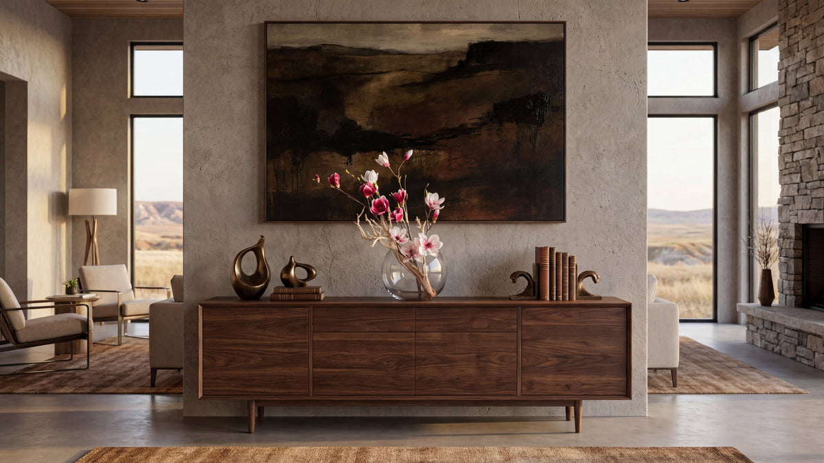
A vase arrangement can bring a room into focus, but the right composition does more than fill an empty vessel. When considering how to style artificial flowers in a vase, begin with the room: its silhouette, color, scale, and placement should feel connected to the architecture and the atmosphere you want to create. Then shape the arrangement around that setting, rather than treating the vase as an isolated accent.
Begin with the feeling the room needs
Before choosing stems, name what feels absent. Perhaps a console looks bare beneath a mirror. Perhaps a dining table feels formal but not welcoming, or a living room has beautiful furnishings yet lacks a softer note. The arrangement should answer that specific feeling rather than introduce decoration without purpose.
Think in terms of atmosphere. A quiet bedroom may call for a gentle, restrained silhouette. A large entry can welcome a more noticeable composition with height and generous movement. A dining table needs a shape that leaves conversation in view. These distinctions keep the arrangement from feeling like an isolated object placed simply because a surface was empty.
Look at the room from the doorway and from the places where people sit or gather. Notice which surface draws the eye, where the light falls, and whether the room needs a focal point or a finishing detail. That first reading will guide every later decision: vessel, height, flower form, color, and exact placement. It can help to take a photograph from the room's main entrance. A photograph makes it easier to notice whether a proposed piece would interrupt a strong line, compete with artwork, or bring welcome balance to an empty area.
Give the room a moment before reaching for a particular color or flower. Ask whether the space feels cold because its surfaces are hard, unfinished because one plane has no visual anchor, or unsettled because several strong elements compete. Each feeling suggests a different response. A room that feels cold may benefit from a more organic outline and gentle color. A blank console may need height and presence. A room already full of expressive objects may need a quieter, more contained arrangement.
It is useful to distinguish a focal point from a finishing detail. A focal point asks to be noticed from the entrance and may carry more visual weight. A finishing detail is quieter: it completes a grouping, softens a transition, or gives a small surface a deliberate purpose. Decide which role the arrangement should play before selecting a vessel. Otherwise, it is easy to choose a beautiful piece that is simply too prominent—or too slight—for the room.
Read the architecture before choosing a vase
A vase belongs to a setting. Its material and shape can echo the room's lines without matching every finish. In a space with strong geometry, a softly rounded vessel can introduce welcome contrast. In a room with curved furniture or arched openings, a clean-lined vase can give the composition a quiet anchor.
Consider what sits around the vase. A polished stone console may suit a vessel with a calm, substantial presence. A narrow side table may need a compact base that leaves room for a lamp or books. On a dining table, the vessel should feel considered from every side, because it will be seen from more than one direction.
Material matters as much as outline. Clear glass lets stems and water-like details remain part of the visual effect, while ceramic or stoneware gives the base more visual weight. A reflective finish can catch nearby light; a matte finish can keep attention on the flowers. Choose a vessel that supports the room's character instead of competing with it. Look, too, at how the vessel meets the surface: a narrow foot can make a generous vase feel lighter, while a broad base can ground a more vertical composition.
Read the room's proportions as a set of relationships, not as a list of individual objects. A tall doorway, a long console, and a low-backed chair create a different visual rhythm from a compact entry with a small table and a framed print. Notice the dominant lines: horizontal, vertical, curved, or mixed. A botanical composition can repeat one line to reinforce the architecture, or introduce a contrasting line to soften it. The contrast should feel considered rather than accidental.
Consider the space above and beside the intended surface. A vase directly beneath a large mirror may need a silhouette that leaves the mirror's center legible. Beneath a tall, narrow artwork, a composition with a modest outward gesture may help balance the vertical line. If a console is already arranged with lamps at both ends, placing an equally tall piece in the center may create three competing peaks. In that case, a lower composition or a shifted placement can let the grouping breathe.
There is no requirement to repeat the room's dominant material exactly. A polished stone setting does not demand a polished vessel, and a timber table does not require a wooden base. Instead, look for a relationship in texture and visual weight. A smooth vessel can offer a pause beside patterned stone. A tactile ceramic form can temper a glossy surface. The aim is cohesion, not a set of matching finishes.
Choose scale with a few practical checks
Scale is relational. The same arrangement can seem graceful on a broad dining table and oversized on a narrow nightstand. Before settling on a height, assess the surface, the furniture around it, and the distance from the composition to nearby artwork, lamps, or architectural details.
- Check the surface width. Leave visible breathing room around the vessel. A generous tabletop can support a fuller base, while a small table usually benefits from a contained footprint.
- Check the surrounding height. Compare the arrangement with a mirror, artwork, chair back, or nearby lamp. It should contribute to the composition without obscuring an important feature.
- Check the viewing angle. Sit down and look across the table or console. A shape that seems balanced while standing may block sightlines when seated.
- Check the room's visual weight. A tall ceiling and substantial furniture can support a more expressive profile. A delicate setting often asks for a lighter outline.
Do not rely on a single formula for height. Instead, imagine the arrangement as one part of a larger vertical composition: surface, vessel, stems, and the wall or open space behind them. If the vase and flowers rise into a mirror or artwork, consider whether the overlap feels intentional. If it does not, reduce the height or move the arrangement.
For a dining table, test the view from each chair rather than assuming the center is the best location. If the arrangement is intended to remain in place during meals, its profile should preserve comfortable conversation across the table. For a console, a little more height may work if the arrangement sits beside, rather than directly in front of, a mirror or artwork.
Use a simple paper outline or a temporary object to test footprint and height before committing to a placement. A folded sheet or a book can suggest the base area; a removable mark on a photograph can help you imagine the top of the silhouette. The purpose is not to imitate the final composition, but to discover whether the intended scale fits the surface and leaves the room's important lines visible.
For a small occasional table, consider the whole use of the surface. If a guest needs space for a cup or a book, a broad base may make the table feel crowded even when the height looks right. A narrow vessel can preserve more usable area, while a wall-side table can often carry a slightly wider profile because it does not need to be approached from every side. Make the decision in the context of how the furniture is used.
Scale also changes with distance. A compact arrangement can disappear in a long room when seen from the entrance, even if it looks beautifully detailed up close. A strong entrance composition may need a clearer outer contour and enough presence to register at a distance. Conversely, a bedside piece is often appreciated nearby, where restrained detail and a modest footprint can feel more appropriate. Step back to the farthest common viewing point, then return to the seating position and test both impressions.
Shape the silhouette with intention
The outline is often what the eye reads first. A compact, rounded form can feel composed and intimate. A taller, open silhouette can lend a room a sense of movement. A design that extends gently to one side may soften a formal surface, provided its direction relates to the nearby furniture or architecture.
Imagine a simple outline before thinking about individual blooms. Is it balanced on all sides, or does it have a clear front? Does it rise vertically, spread outward, or create a soft asymmetry? Each can work, but the choice should suit the place. A central dining arrangement benefits from a considered all-around profile, while a console piece may be designed primarily for a front-facing view.
Keep the shape legible. Too many competing directions can make a composition feel restless. Choose one main gesture, then let smaller details support it. The result need not be perfectly symmetrical; it needs to look deliberate from the views that matter in the room. Think about the negative space within the outline as well as the blooms themselves. Openings can make a taller arrangement feel airy, while closely grouped forms create a denser, more intimate presence.
A useful way to test the outline is to imagine it in silhouette. Squint slightly or look at a small photograph of the room. If the arrangement reads as one clear form, its shape is likely doing its work. If several unrelated peaks and directions appear, decide which one should lead and which details can be quieted. This small visual test is helpful because individual flowers may be lovely on their own while the overall outline remains unsettled.
Think about the front of the composition before placing it. On a console against a wall, the arrangement can direct its most expressive side toward the room. On a dining table, where the piece is approached from several directions, the profile should feel resolved all around. On a kitchen island, people may see it while walking past as well as while seated, so a single flat front may not be the right answer. The intended viewing pattern informs how open or evenly distributed the silhouette should be.
Asymmetry can be graceful when it has a reason. A slight lean toward an open area can balance a lamp or a piece of art on the other side of the surface. A strong extension toward a crowded area can make the grouping feel lopsided. Look at the negative space around the composition: the empty area on one side may be as important as the flowers on the other. Use that relationship to decide whether to shift the vase, rotate it, or choose a more contained outline.
Bring color into the room's palette
Color can either settle into the existing palette or provide a controlled point of contrast. Start by noticing the dominant tones in the room: upholstery, rugs, artwork, wood, stone, and wall color. Then decide whether the flowers should repeat one of those tones, soften it, or offer a more expressive accent.
Repeating a color does not require an exact match. A subtle relationship between a flower tone and a detail in a painting can make the arrangement feel connected without appearing coordinated in a literal way. A tonal palette can bring calm, while a single contrasting note can draw attention to an overlooked corner.
Also consider the amount of color. A richly colored arrangement can become a focal point, especially against a quiet backdrop. A more restrained palette can preserve the prominence of nearby art or materials. If several colors are already active in the room, a limited arrangement may help the space feel more composed. Consider the room's undertones, too: a flower that reads cool in bright daylight may look warmer under evening lamps, so assess the palette in the light in which the room is most often enjoyed.
Look at the palette in layers. First notice the largest field of color, often a wall, rug, or sofa. Then notice smaller accents in artwork, cushions, books, and objects. A composition can connect to the large field by using a related tone, or pick up a discreet accent to bring that detail into the wider room. Avoid trying to repeat every color at once. One clear relationship is often enough to make the arrangement belong.
If the room is mostly neutral, a single stronger color can bring focus, but the intensity should relate to the scale of the space. A small, saturated arrangement may work as a jewel-like detail on a side table. A large arrangement with several strong tones may become the room's main event. That can be right when the space needs a focal point; it can be distracting when a painting or architectural feature is intended to lead. Choose the hierarchy deliberately.
When the room already contains patterned textiles or expressive art, consider a quieter palette and let form carry more of the interest. This does not mean the arrangement must disappear. A tonal composition can still have presence through its silhouette, vessel, and texture. Conversely, a quiet room with few visual accents may welcome a more pronounced color note. Review a photograph of the complete room rather than judging the flowers against a blank background alone.
Give the vessel the same attention as the flowers
The vessel is not an afterthought. It establishes the visual base and determines how the arrangement meets the surface. A narrow opening can gather stems into a more contained profile. A wider opening can allow a broader composition, though the shape should still look intentional rather than loosely dispersed.
Pay attention to proportion between vessel and flowers. A low vessel with a sweeping profile can feel grounded on a coffee table. A taller vase may bring needed verticality to a console. A decorative vessel can stand as an object in its own right, so the arrangement above it may be quieter. If the flowers carry the strongest expression, a simpler vase often gives them room.
Think about the surface beneath it, too. A transparent vase may relate differently to a patterned stone top than an opaque one. On a glass table, a substantial vessel can help anchor the composition visually. On a richly grained wood surface, a smooth, restrained finish can create a useful pause. The vessel and tabletop should feel like parts of one arrangement, not separate decisions.
Opening size affects the character of the design. A narrower opening naturally gathers the stems and can support a focused, upright outline. A broader opening allows more lateral movement, but it also asks for a considered structure so the composition does not look scattered. Think about the profile you want before choosing the vessel, then ask whether the opening supports it. The vessel should make the desired shape easier to understand.
Consider the vessel's visual weight from a distance. A dark or substantial base can anchor a tall outline, particularly on a broad console. A very light vessel can keep attention on the flowers, though it may look insubstantial on a large table. There is no universal rule: compare the base with the table, wall, and nearby objects. If the vessel seems to float or dominate, adjust its material, finish, size, or position.
A configured piece can help when the relationship between vessel and composition is already resolved. If you are considering a different vessel for an existing composition, pause to assess its opening, height, finish, and footprint as a group. A vessel that is attractive by itself may alter the outline or visual balance. Imagine both objects together on the intended surface, not as separate purchases in isolation.
Use light as part of the composition
Light affects how color, texture, and shape are perceived. Observe the surface at different times of day, and note whether it receives direct sun, soft window light, or mostly ambient illumination. A position that looks balanced in the morning may feel visually heavy in the evening when the room is lit by lamps.
Place the arrangement where its details can be appreciated, but avoid forcing it into the brightest spot without considering the room as a whole. Reflections from glass, polished surfaces, or nearby windows may add visual interest or create distraction. Step back and assess the full scene rather than judging the vase in isolation.
Light also helps clarify the arrangement's role. If it is meant to be a quiet accent, a position with gentle illumination may be enough. If it serves as a focal point, make sure the surrounding setting gives it visual space. The goal is not to make the flowers dominate every view, but to let them belong naturally to the atmosphere.
Review the proposed position in both daytime and evening conditions if the room is used at both times. A bright window can make a pale arrangement feel crisp, while evening lamps may draw attention to its warmer tones and shadows. A reflective vessel may also pick up nearby light sources, becoming more prominent after dark. These changes are part of the room's character. A simple adjustment in placement can help the composition feel settled throughout the day.
Do not assess a piece only against a bright window or a blank wall. Place it in the actual visual field, then look at the contrast between the flowers, vessel, and background. If a delicate outline disappears against a complex surface, a different position or stronger vessel may clarify it. If a dark vessel merges into a shadowed corner, the arrangement may need a lighter setting. Judge the whole scene from the doorway and from the seats where people spend time.
Place the arrangement for how the room is used
A beautiful composition must work with daily life. On a dining table, preserve clear sightlines and enough usable surface for place settings. On a coffee table, consider the reach of the seating and the objects that share the surface. In an entry, avoid narrowing the path or placing the vase where a door or passing movement could disturb it.
For a console, check the relationship between the vase, mirror, artwork, and any lighting. A balanced grouping usually has more than one height, but the elements should not all compete for attention. A book or sculptural object can support the composition when it has a reason to be there; adding accessories merely to fill space tends to make the surface feel crowded.
Once placed, view the arrangement from the room's main approaches. Make sure its strongest face is visible where it matters. If the piece is viewed from several directions, a more evenly considered profile may be appropriate. Leave a little negative space around it. The surrounding quiet is part of the design.
For a dining table, ask how the surface changes between an ordinary meal and a larger gathering. An arrangement that consumes the center may make the table feel less usable. A contained footprint and a clear view across the table can support conversation, while a more elaborate setting may allow a distinct centerpiece for a particular occasion. Consider whether the piece is intended to stay in place or be moved when the table is in use, and choose its scale accordingly.
A coffee table has different demands. People reach over it, set down objects, and view it from sofas and chairs at close range. Leave clear space for those uses. A low, grounded composition may be more comfortable than a tall, visually dense one, especially when the table sits between facing seats. If the table is large, a single arrangement can anchor the center, but it need not be surrounded by many smaller objects. A deliberate grouping with room around it often feels more composed.
In an entry, consider the path from the door to the room beyond. A piece should not narrow a natural route or sit where a bag, coat, or passing movement is likely to catch it. A console arrangement can welcome the eye without obstructing the function of the surface. If the entry has a prominent view into the home, look at how the composition relates to the next room as well; an arrangement should connect with the larger visual sequence rather than feel like a separate vignette.
Bedrooms and private sitting rooms often reward restraint. A bedside surface may need to remain available for practical objects, so a compact composition can be more fitting than a generous centerpiece. On a dresser, the arrangement can help balance a mirror or a collection of personal objects, but it should not conceal details that matter to the room. Treat intimacy as a design quality: the piece can be subtle and still feel intentional.
In rooms with more than one viewing axis, check the composition from each approach. A living room may be entered from a hall and also seen from a dining area. A piece that is beautiful from the front can look unfinished from the side if the room exposes it from several directions. Consider rotating the vessel or selecting a more evenly composed profile. Small changes in orientation can make the arrangement feel naturally integrated.
Follow a measured styling process
- Identify the purpose. Decide whether the arrangement should soften a room, finish a surface, or create a focal point. Write the answer in a few words so you can refer to it when choices become difficult.
- Select the location. Choose a surface that has enough room and suits the way people move through or use the space. Note whether the arrangement will be seen from one direction or several.
- Assess the setting. Note the architecture, furniture scale, light, nearby colors, and important sightlines. Photograph the room from the entrance and from a seated position.
- Set the silhouette. Choose a contained, rounded, vertical, or gently asymmetrical outline that suits the placement. Decide whether the composition needs a clear front or a resolved all-around profile.
- Choose the vessel. Consider opening, height, material, finish, and how the base relates to the surface. Ask whether its visual weight supports the intended outline.
- Review from a distance. Look from the doorway and seated positions. Adjust the placement or scale if the arrangement obscures a feature or feels disconnected.
- Remove what is unnecessary. Give the composition room to breathe. An arrangement should not require a crowd of accessories to feel complete.
This sequence is useful whether choosing a ready-composed piece or discussing a room-specific design. It helps turn a broad preference into clear observations: where the arrangement belongs, what scale the room can carry, and which qualities would make the composition feel at home. Before making a selection, note the intended surface dimensions, the view from the main approach, and the surrounding colors. Those specifics make the design decision more grounded.
For example, imagine a long console in a softly colored entry. A framed work is centered above it, and a lamp occupies one end. The first question is not which flowers match the wall; it is whether the console needs a focal point, and where that focal point can sit without obscuring the framed work. A modestly asymmetrical composition placed away from the lamp could give the surface a new center of interest. A restrained palette that picks up one detail in the artwork may connect the arrangement to the room without copying it. Reviewing the view from the doorway confirms whether the choice is legible at a distance.
Now consider a dining table in a room with a strong chandelier. The table may already have a clear vertical focal point overhead, so an equally tall centerpiece could make the composition feel crowded. A lower, broader outline may relate more naturally to the table and preserve conversation. Check the view from each chair, then make sure the vessel does not occupy more usable surface than the household is comfortable giving it. This is a different design problem from the console, even if the same palette appears in both rooms.
A third setting might be a side table beside a reading chair. Here, the arrangement is seen close up and from one or two angles. The table may already hold a lamp and a book, so the available footprint is limited. A small, composed silhouette can provide a gentle botanical note without competing with the objects used each day. If the table is near a window, look at the scene in daylight and again when the lamp is on. These concrete checks make the choice more useful than relying on a general preference for a particular flower or color.
Keep a short room note while you make decisions: surface dimensions, approximate height available, dominant colors, the main viewing direction, and the atmosphere you want. A note like “quiet entry, narrow console, pale stone, seen from the doorway, needs a clear vertical accent” is more informative than “something pretty.” It gives you a practical brief for comparing silhouettes and vessels, and it makes it easier to explain what feels right or wrong when reviewing a composition.
Know when a configured piece is enough
A configured composition can be a natural choice when you already know the location, approximate scale, and visual character you want. It is especially useful when a particular surface needs a defined finishing touch and the surrounding room is already settled. Review the product details carefully and consider the vessel, dimensions, and view from the intended placement before making a selection. For ideas on botanical forms within a considered interior, see this guide to selecting lifelike botanical pieces.
When a room presents several connected decisions, a design conversation may be more helpful. A consultation can begin with the setting and the desired atmosphere, then consider proportion, placement, vessel, and botanical form together. Jardin Du Monde offers design discussions virtually or in person; delivery and on-site styling are available upon request, not included with every purchase.
For a room-specific proposal, share useful context such as photographs, approximate ceiling height, dimensions of the intended surface, nearby furnishings, and the light at different times of day. These details help describe the space. They do not replace an in-person assessment where one is needed, and the appropriate arrangement depends on the room and the design brief. You may also explore how statement botanical pieces are selected for interiors for additional context on scale and placement.
A consultation can be particularly useful when the intended piece must relate to several parts of a room at once. Perhaps the arrangement needs to sit between a window and a painting, or a larger room has several connected surfaces that should feel coherent. Rather than beginning with one isolated object, describe the room's overall atmosphere and the role you want botanical art to play. A discussion can consider the placement, scale, vessel, and surrounding furnishings together before a room-specific proposal is prepared. Virtual and in-person design discussions are available; the appropriate format depends on the conversation and the project context.
For a more useful first conversation, gather a few observations rather than trying to solve the design in advance. Share clear photographs from the main approach and seating positions, describe how the room is used, and identify any features that should remain prominent. If there is a particular surface in mind, note its approximate dimensions and what else must remain on it. A short description of the atmosphere you want—calm, welcoming, sculptural, or more expressive—can be just as helpful as a list of preferred flowers.
The path from conversation to proposal is not the same as selecting a configured catalog piece. A room-specific discussion is for a setting where the arrangement's scale, position, vessel, or relationship to the architecture needs to be considered together. Delivery and on-site styling are available upon request, not included with every purchase. Keep those boundaries clear as you decide which path best fits the room. For a single surface with known dimensions and a settled palette, reviewing configured pieces may be sufficient. For several connected design questions, a consultation can help frame the brief.
When reviewing a configured composition, read the listed dimensions rather than relying on product photography alone. Consider the photograph's angle, the apparent scale of the room shown, and the relation between flowers and vessel. Then compare those details with the actual surface in your home. A product can be visually appealing but still require a different location than you first imagined. If the dimensions and character suit the room, a configured selection offers a direct route to completing that particular surface.
Common styling missteps to avoid
- Choosing by color alone. A pleasing flower tone may still feel wrong if its scale or silhouette does not suit the room.
- Ignoring the vessel. The base affects the visual weight of the entire arrangement and its relationship to the surface.
- Blocking the view. Check seated sightlines, mirrors, windows, artwork, and practical use before committing to a placement.
- Filling every open area. Negative space can make a composition feel more deliberate and allow architectural details to remain present.
- Over-coordinating. Repeating every color and material exactly can make a room feel arranged rather than naturally composed. A quieter relationship is often more elegant.
- Forgetting the full room. Judge the arrangement in context, including nearby furniture and the path through the space, rather than by itself.
Another common misstep is choosing a vessel before deciding where the arrangement will live. A beautiful vase may have the wrong footprint for a small table or the wrong visual weight beneath a large mirror. Start with the room and surface, then select a vessel that helps achieve the intended outline.
It is also easy to overestimate how much height a room needs. A tall ceiling does not mean every arrangement should be tall; the neighboring furniture, artwork, and purpose of the surface still matter. Likewise, a small room does not require every object to be tiny. The question is whether the composition sits comfortably within the visual field and leaves the room's important elements legible.
Finally, do not assess an arrangement only from the position where it was selected. A piece may look composed from the front but obstruct a mirror from the side, dominate a table from a seated position, or disappear against a patterned background. A few slow checks from the doorway, from nearby seats, and at different times of day can reveal whether a small adjustment is needed. This review is part of styling, not a sign that the original choice was wrong.
Let the arrangement complete the room
The most successful vase arrangement feels neither incidental nor imposed. It responds to the room's scale, carries a clear silhouette, relates thoughtfully to its vessel, and contributes to the atmosphere without interrupting how the space is used. Begin with the feeling the room needs, then make each choice in service of that purpose.
Book a private design conversation
With a considered relationship between architecture, light, color, and botanical form, a vase can become the quiet detail that makes a room feel complete.


